Never assume that venues (art galleries, nonprofit spaces, co-ops) will do all of the work for you. They have much on their minds and can't give you their full attention.
Here's a list of things to think about.
The post The Artist's Responsibilities for Any Exhibition appeared first on Art Biz Success.
]]>
The post The Artist's Responsibilities for Any Exhibition appeared first on Art Biz Success.
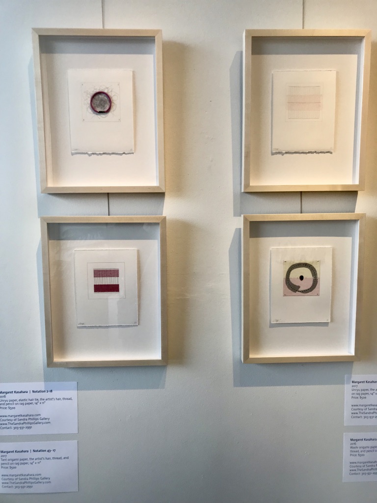
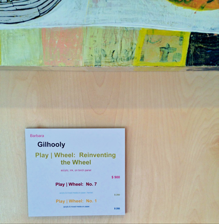
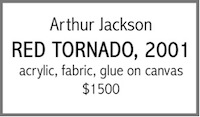
]]>In order to give yourself proper credit for your art, it should have an object label next to it—wherever it's shown, in person or online.
The only wrong way to do this is to not do it at all. I suggest you standardize your format so that it's easy to use every time.
The post Pointers on Wall Labels for Your Art Exhibition appeared first on Art Biz Success.
]]>
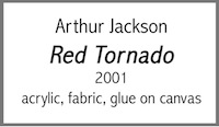
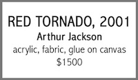
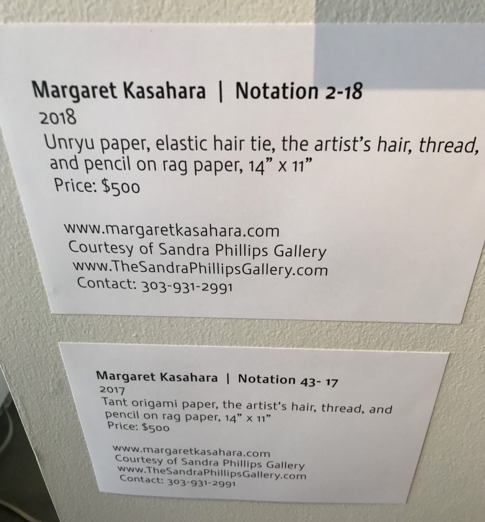
The post Pointers on Wall Labels for Your Art Exhibition appeared first on Art Biz Success.
]]>Museums have permanent collections that they own, but they don't keep the work in one place. They present fresh viewpoints, mixing up the pieces to give new perspectives. They also approach curating as an additive process. You start with the best and add only what will strengthen the curatorial thesis.
A museum would never try to cram as much as possible into one show.
The post Curating the Art on Your Artist Website appeared first on Art Biz Success.
]]>And I’m not talking about exhibitions here. I’m talking about how you’re showing the work on your website.
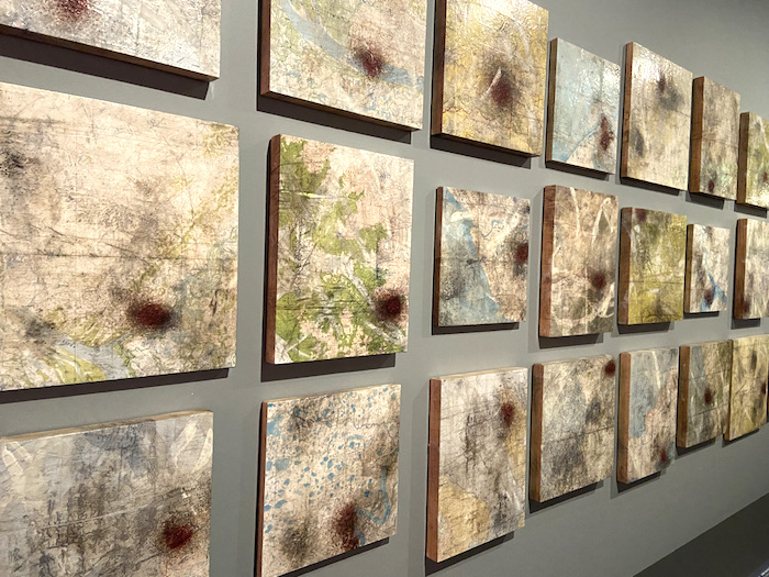
Think Like a Museum Curator
In a separate post I discussed the value of curating your art and approaching it as an additive rather than subtractive process.
I wrote:
The first step in curating your art is to start with a piece or two that best represent what you’re trying to communicate. After you’ve done this, you can build your exhibition or Web page around that piece.
If you find you have too many in the end, you can start subtracting.
That’s how I hope you view your website. Start with the strongest work and add only additional work when it makes the collection stronger. If you’re honest with yourself, you know that some of the work won’t stand up.
The Magic Number of Pieces to Show
The question that prompted this article was from a reader who wondered whether or not there is a sweet spot for the amount of inventory visible to viewers, collectors, gallerists and curators. There is no such sweet spot that would satisfy all of these groups of people, but I’ll take a stab at an answer.
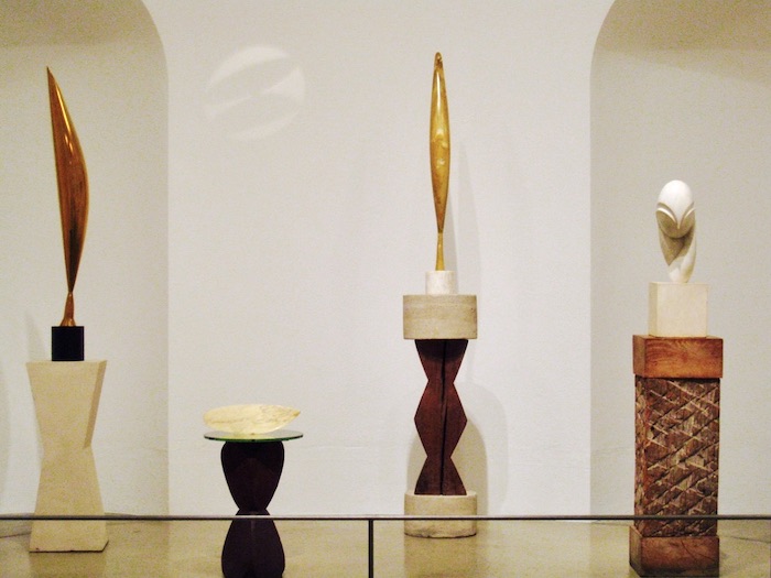
I have found that 12-15 images per website page is a good number, but impact trumps any formula.
Impact, above all else, is what you’re after. If you want people to say “WOW!” consider the following.
- What are you trying to communicate?
- What number, what piece, what grouping best communicates your idea?
- Why should you include that work? Why is it important? What does it contribute to the works you’ve already selected?
- What should you leave out? What has already sold? What doesn’t belong? What should you rethink/rework?
And … You can’t make an impact online with tiny images. Thumbnails should take up most of the width of a visible page. In I’d Rather Be in the Studio, I suggest thumbnails no smaller than 150 pixels wide, but 200-250 would be even better. In other words, thumbnails that are as big as possible.
After you have lived with the work for awhile, you might feel the need to mix things up. Again, we can go back to how curators work in museums.
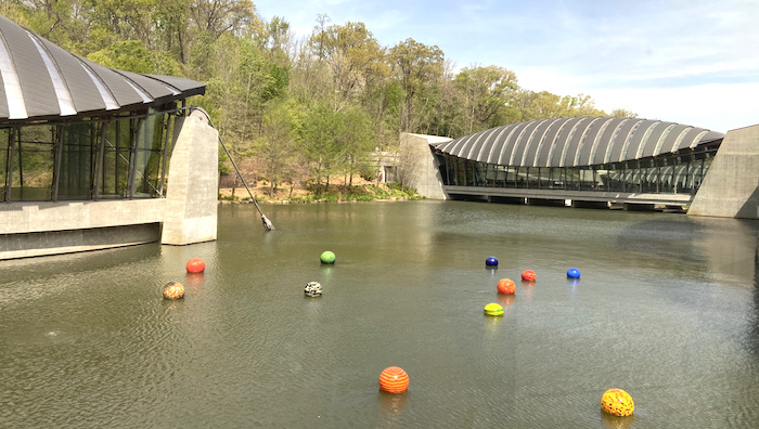
Dale Chihuly’s floating glass orbs, Niijima Floats at Crystal Bridges Museum of American Art.
Mix It Up
Museums have permanent collections that they own. The works are always in their possession, whether they’re on the wall or in storage. If the art stayed in the same place all of the time, the museum risks its role as a dynamic force in the interpretation of culture.
Museums must frequently present art in new contexts. Times change, new curators with their own viewpoints come on staff, and additional objects are added to the collections.
Fresh installations of the art stave off visitor boredom. People look at the work differently and are less likely to dismiss the art with the statement “I’ve already seen that.”
Museums do this through exhibitions. You can do the same in a brick-and-mortar space, or do it through virtual exhibitions on your website, in your newsletter, in carefully crafted blog posts, in album groupings on Facebook, or on Pinterest boards.
The bottom line is that I encourage you to approach the curatorial process like you’re making a piece of art because you are. You are creating a composition from separate parts that might have different meaning when discovered in new combinations.
Want more examples for remixing your work? Read this post.
This post was first published on August 21, 2013 and has been updated with original comments intact.
The post Curating the Art on Your Artist Website appeared first on Art Biz Success.
]]>Cathy wrote pages and pages about a new body of work. Then she got an idea from another lesson to leverage all of that writing she had done. She put it to work and turned her written stories into audio for an exhibition.
The post Turning journaling into audio for your art show with Cathy Read (43) appeared first on Art Biz Success.
]]>In the spring of 2018, Cathy Read took my Magnetic You course. This class isn’t for the faint of heart because it involves a lot of writing. And, if you’re like most of my clients, you really would prefer to get by without more writing.
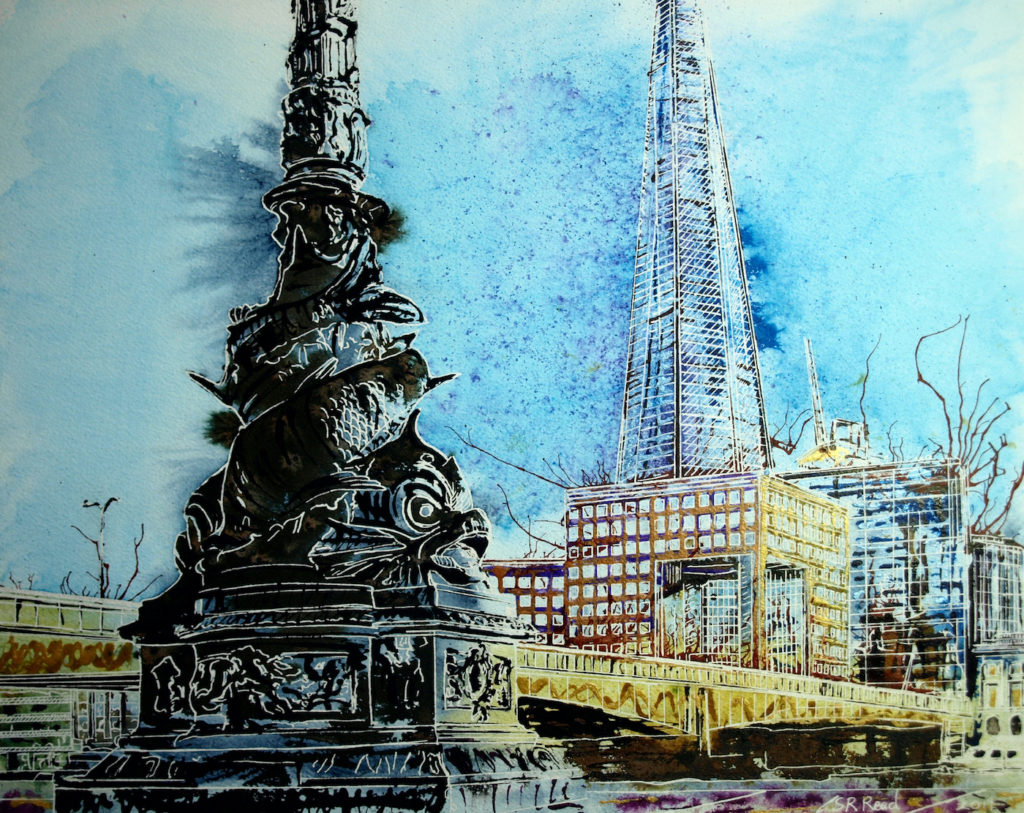
We work on your artist statement, bio, about page, stories about your art, and your branding. All of your hard work leads to a cohesive presentation that makes you more attractive to buyers, curators, and collectors.
One of the most important lessons in Magnetic You involves meditating on your art. You read that right. Meditating on your art. I insist that art speaks when you give it the time and space to tell you its story. Then you have to capture that story in a journaling process.
Cathy wrote pages and pages about a new body of work. Then she got an idea from another lesson to leverage all of that writing she had done.

The writing didn’t just stay in a notebook or in a file somewhere in the dark depths of her computer. Nooooo. She put it to work and turned her written stories into audio for an exhibition.
The leap Cathy took from written word to audio involves a different way of thinking. It’s much like how museums consider programming their shows. They don’t simply put up the art along with nearby labels. They have docents who lead tours, scholars who give presentations, activities to expand on a theme, and audio for telling stories.
Why shouldn’t artists do the same when they have their own solo shows?
I asked Cathy all about the process and experience in this episode of the podcast.
Music by Wildermiss.
Highlights
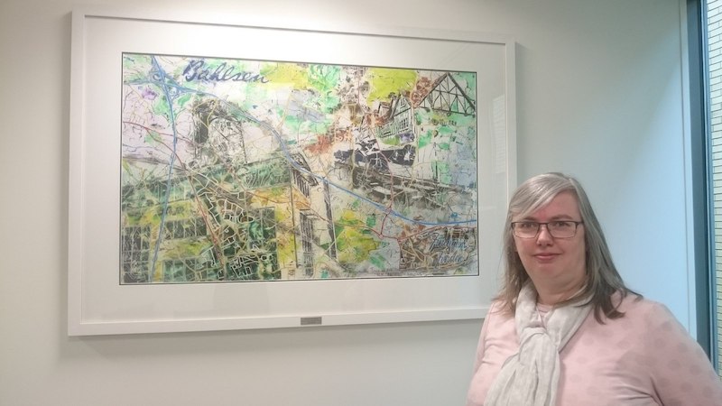
- Cathy’s career path starting with caricatures and developing into architectural painting with abstract elements. (2:40)
- How Cathy developed the interest in architecture which informs her work. (4:22)
- Her experience with the meditation exercises she learned in the Magnetic You class. (7:10)
- The decision Cathy made to dictate her meditations. (9:20)
- The detailed process she underwent of writing then speaking the words that helped her clarify her message about the work and why she feels it makes her descriptions more interesting. (11:55)
- How Cathy got the idea to include the audio in her solo exhibition using lessons from Magnetic You on how to engage your audience. (14:35)
- The process of recording the audio and how she perfected it. (15:40)
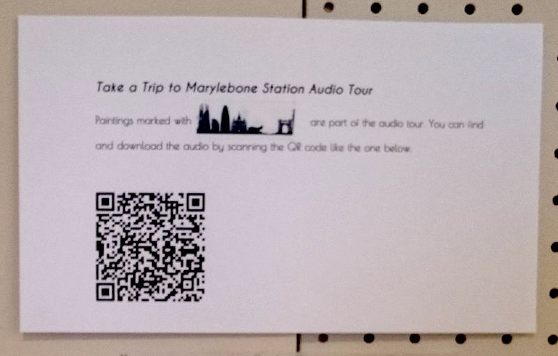
Label explaining how to use the QR codes within Cathy’s exhibition. - How she made the audio available at her exhibition using a QR code, and other ways she leveraged the recordings on her blog. (19:00)
- Visitor experience with the audio recordings and hiccups they encountered. (23:20)
- Why Cathy thinks its valuable for viewers to hear her voice. (24:50)
- What she learned and what she will do differently next time. (26:25)
- My suggestion for Cathy to encourage more engagement with the audio from visitors. (28:30)
- How Cathy plans to continue her meditation process for upcoming shows. (30:40)
- The full list of what she’s working on now. (32:00)
Mentioned
How to make a QR Code
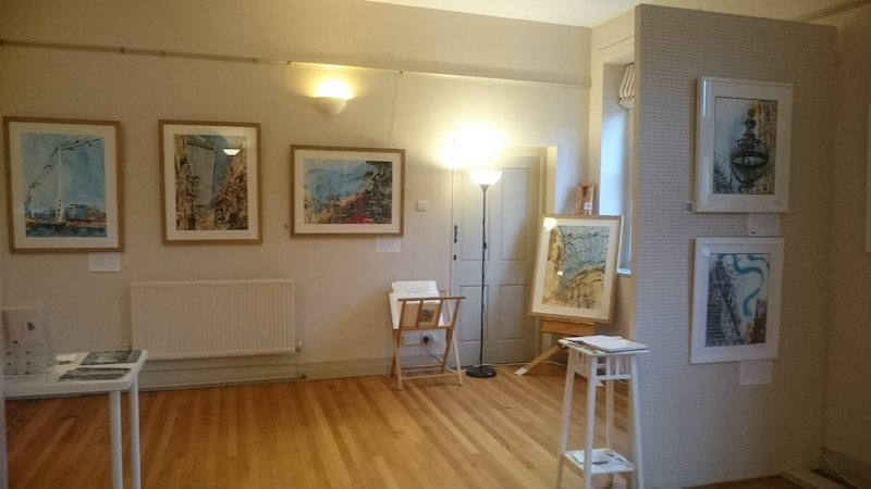
The Stables in The Courtyard at Claydon Estate, exhibition venue
Google Keep
About Cathy Read
Cathy Read re-imagines iconic architecture using explosive, colorful drops and trails of paint, held together with a structure of white lines. Inspired by looming and dramatic architecture, she draws on influences from various nearby cities.
She lives near Buckingham, England, and is a member of the Society of Women Artists, receiving their Barbara Tate Memorial Award in 2015. Cathy has also shown with the Royal Watercolour Society and the Royal Institute of Painters in Watercolour in London.
Cathy appeared as a contestant on Sky Arts Landscape Artist of the Year in 2016, returning as a wildcard in 2017. The same year, she was shortlisted for Artist and Illustrators Artist of the Year and received the Wild and Tame award.
Her work can be found in collections in the Canada, Africa, New Zealand, and the U.K., including the Ashmolean Museum in Oxford.
Follow Cathy on Instagram @CathyReadArt.
Music by Wildermiss.
The post Turning journaling into audio for your art show with Cathy Read (43) appeared first on Art Biz Success.
]]>If you have an important exhibition coming up, give it the (virtual) space it deserves. Create a page on your website for your show.
You probably already have a page for all of your exhibitions, but I’m talking about a single page that features only your special show.
This will be the premier place you send people for details about the exhibition, which will be easy for people to read because it only has one focus. It doesn't include anything else.
Why would you share this info only on Facebook or in an email when you can create a storefront for your art? You’re paying for the virtual real estate already. Might as well use it!
Everything will be in one spot rather than scattered around online or in someone’s inbox.
The URL (website address) should be one that’s easy to share and to remember rather than a string of slashes and numbers. This isn’t always as easy if you have a template site, but make it happen if possible.
Here’s what your exhibition page should include, and I suggest listing everything in this order.
The post How to Promote an Art Exhibition on Your Website appeared first on Art Biz Success.
]]>If you have an important exhibition coming up, give it the (virtual) space it deserves. Create a page on your website for your show.
You probably already have a page for all of your exhibitions, but I’m talking about a single page that features only your special show.
This will be the premier place you send people for details about the exhibition, which will be easy for people to read because it only has one focus. It doesn’t include anything else.
Why would you share this info only on Facebook or in an email when you can create a storefront for your art? You’re paying for the virtual real estate already. Might as well use it!
Everything will be in one spot rather than scattered around online or in someone’s inbox.
The URL (website address) should be one that’s easy to share and to remember rather than a string of slashes and numbers. This isn’t always as easy if you have a template site, but make it happen if possible.
Here’s what your exhibition page should include, and I suggest listing everything in this order.
Title of Exhibition
All of your exhibitions should have titles to distinguish them from one another. If they are solo shows, your name should be in the title.
Dates
When are the first and last days people can see the work?
Too often, we advertise only the opening, but some of your fans might not be able to attend on that date. Be clear about the exhibition duration.
Location Name
At this point on the page, you only need to put the name of the venue. Below, as you’ll see, you will give more details.
Short Blurb about the Exhibition
Include a couple of sentences that describe what people will see when they attend. If, for any reason, your name isn’t fully visible on the page (i.e. if people have to scroll or it isn’t in the title), make sure to include it within the blurb.
Images of Your Art
This is not the time to hold back. Share images of the work that will be on view. You don’t have to show all of it, but show enough to entice people.
Size the images large enough to make an impact. The trend online is to have BIG pictures. Anything too small looks old-fashioned.
TIP: Link to any blog posts or videos that describe the artwork or process.
Include your prices if you’re in control of sales rather than the venue. Plenty of artists are selling their work before it ever goes on public view. Wouldn’t this be nice?
Exhibition Location Details
Repeat the name of the venue, and then add:
- Open hours
- A link to the venue website
- Phone number
- Street address, city, and state/province
Don’t leave off the city and state/province! Your website is available to people in all corners of the world. If people land on this page, you don’t want them to have to guess what city you’re in.
Include a photo of the location if it might be helpful for visitors to recognize or (especially) if it’s impressive.
As a courtesy, it’s nice to give any tips for parking.
Related Exhibition Events
What’s happening around your exhibition? People want to know they’re invited! Issue a heartfelt invitation around any of the following events.
- Opening reception
- Gallery talk
- Demonstrations
- Tours or times you’ll be at the space
- Anything else you’re planning to activate the space during the show
Note dates and times for each event, remembering to include an ending time as well as the time it begins. You don’t want guests embarrassed by showing up after most people have gone home.
Don’t forget to mention:
- Any fees that might pertain
- Whether it’s by invitation only or open to all (Bring a friend!)
Here you could add another image, perhaps of you giving a talk or demonstration.
Visitor Tips
Going to a gallery is part of a night on the town for many people. Can you suggest nearby attractions?
Other galleries? Restaurants? Museums? Include links to those sites.
Contact Me
Always provide a way for people to get in touch and ask you questions, even if it’s a link to the Contact page on your site.
If it’s your show, the invitees are your guests. Be a friendly and accommodating host or hostess.
A photo of you with your art would be a nice touch.
Putting all of this together on one page will make it easier to promote and show off your work. It’s well worth the effort for an important show.
This post was originally published on February 4, 2016. It has been updated and republished with original comments intact.
The post How to Promote an Art Exhibition on Your Website appeared first on Art Biz Success.
]]>Coffee shops would love to have your art!
Salons would fawn over it!
Professional offices would think they’d died and gone to heaven!
This is great news for you, especially when you are just starting out. It’s a stamp of approval when public spaces want to show your work.
Almost every artist does the “free” circuit. It’s where you get your toes wet.
These seemingly low-risk venues offer a venue for you to learn how to:
- Properly prepare and price your art for installation
- Curate a body of work because not everything you have made is fabulous and looks great together (Sorry)
- Install your art correctly
- Promote your art in a brick-and-mortar space
In addition, live venues test your conversational and and negotiating skills. There’s rarely a formal agreement in these venues, but you’d be wise to add that to your list of learning opportunities.
Because these non-art venues are considered less serious than galleries, many artists put very little effort into the process. After all, you’re looking for (here comes the e-word) “exposure.”
You deliver the work, install it yourself, add labels, and then, when the time comes, deinstall it and take it home.
Or perhaps the date for deinstallation is left open.
Six months fly by and your work is still there. The owners and patrons have gotten used to it. They quite enjoy having the nice backdrop. The owners don’t want to see it go, so they aren’t responsive to your attempts to communicate with them.
Your art show has turned into free décor.
Let me be clear that
The post Is Your Art Just Free Décor? appeared first on Art Biz Success.
]]>Coffee shops would love to have your art!
Salons would fawn over it!
Professional offices would think they’d died and gone to heaven!

This is great news for you, especially when you are just starting out. It’s a stamp of approval when public spaces want to show your work.
Almost every artist does the “free” circuit. It’s where you get your toes wet.
These seemingly low-risk venues offer a venue for you to learn how to:
- Properly prepare and price your art for installation
- Curate a body of work because not everything you have made is fabulous and looks great together (Sorry)
- Install your art correctly
- Promote your art in a brick-and-mortar space

In addition, live venues test your conversational and and negotiating skills. There’s rarely a formal agreement in these venues, but you’d be wise to add that to your list of learning opportunities.
Because these non-art venues are considered less serious than galleries, many artists put very little effort into the process. After all, you’re looking for (here comes the e-word) “exposure.”
You deliver the work, install it yourself, add labels, and then, when the time comes, deinstall it and take it home.
Or perhaps the date for deinstallation is left open.
Six months fly by and your work is still there. The owners and patrons have gotten used to it. They quite enjoy having the nice backdrop. The owners don’t want to see it go, so they aren’t responsive to your attempts to communicate with them.
Your art show has turned into free décor.
Let me be clear that I have nothing against showing work in these places. As I said above, I think they are training grounds for many artists.
What I am against is you missing out on possibilities. Decorating a space for free.
It doesn’t have to be this way. There are three ways to benefit from showing your work in non-art spaces.
1. Ask for a trade.
If you could benefit from what the venue offers, trade your art loan for their products or services. People need to know the value of your art.
2. Structure your agreement as a rental or rent-to-own.
Charge a small monthly rental fee that could lead to purchase if the renters don’t want to give up the work. Be sure to use a detailed written agreement that spells out all of the terms.

A quick Web search uncovered an art venue that leases art at 3-5% of the retail price, with the possibility that 75% of rental fees could be applied to a purchase.
3. Approach the installation as if it were full of possibilities.
Any venue is less serious if you believe it to be. If you don’t do anything but install the work, you have only yourself to blame for poor results.
To ensure your art is more than decoration, treat every venue as an opportunity for professional advancement. Learn how to improve on the list of opportunities at the top of this article.
To that list, I’ll add two last pieces of advice. First, get to know the staff. You can’t be there all of the time, but they are. They are a potential salesforce for you.
Second, be visible at the venue. Frequently.
This post was first published in 2014 and updated in 2018. The original comments have been left intact.
The post Is Your Art Just Free Décor? appeared first on Art Biz Success.
]]>The post Curate a Solo Show of Your Art appeared first on Art Biz Success.
]]>Are you still diddling around with juried shows or exhibitions with your art group?
There’s nothing wrong with either one of these as a starting point, but there comes a time when you have to leave the nest. You have to plan a solo exhibition.
Your career will grow rapidly when you start having solo exhibitions of your art.

Solo shows are the pinnacle of an artist’s career, but in most artists’ dreams they usually take place at fine galleries and museums.
Those prestigious venues will happen for those who persevere. In the beginning, you will probably need to curate your solo show for less lofty places.
All possibilities are on the table: restaurants, private homes, rented storefronts, bank lobbies, salons, or your garage.
The location doesn’t matter too much. What does matter is that it’s only your work and that you have an opening or event to invite people to.
Why Go Solo?
A solo show stretches all of your professional muscles.
In sponsored group shows, you follow the rules. Someone else sets the dates and deadlines while telling you the exact format for everything.
When you put together a show of only your work, you make the rules. This forces you to be organized and proactive. You realize that you are in charge of your destiny.
When you’re part of a group show, you never know whose work is going to be next to yours. You can’t be assured of the quality.

For your own show, you know precisely what to expect from your work. This means you have 100% control and 100% responsibility.
This is daunting, which is why not all artists can pull it off.
A solo exhibition forces you to look at your body of work, not just 2 or 3 pieces that you will submit to a jury. You must think about what ties the work together, and how others will interpret it.
The entire process develops your critical thinking. You have to decide what to include, which pieces to put next to one another, and how to interpret the work for your audience.
You must come up with language for your statement, for your publicity, and for talking with the public about your art. It’s fairly easy to do this with a single piece. It’s harder, yet necessary, to do for a complete body of work.
Make It Happen
Commit to having at least one solo exhibition this year.

As I tell my private clients, you don’t have to know how it will happen. You just have to make the commitment.
All kinds of things will work in your favor once you commit to taking a big step.
Notice when you find yourself thinking of all the reasons that you can’t accept this challenge. These are probably excuses.
Reframe the situation and start figuring out how you can make it happen. Remind yourself of the good things that could result from taking this step.
The post Curate a Solo Show of Your Art appeared first on Art Biz Success.
]]>The post Yep, It’s Art and It’s for Sale appeared first on Art Biz Success.
]]>Or this version: A friend shares an image of your art that you posted on Facebook. Hundreds of people see it and a handful wish they could own it. But they think they can’t afford it because there’s no price. So they forget about it and move on.
These stories might seem crazy to you, but I didn’t make them up. My readers shared them with me.

If you think about it, it’s not so mind-boggling that viewers don’t know your art is for sale.
Many people are accustomed to seeing art in museums, where there are no prices because the work isn’t for sale. This could lead to the misconception that all art without prices isn’t for sale (or isn’t affordable).
Are you sure that people know your art is for sale?
Post the Price
The easiest way to tell people that your art is for sale – short of a giant sign that says “THIS ART IS FOR SALE” – is to post the price when you show it.
I’m not talking about neon signs or obnoxious flashing red text with Buy It Here arrows. I’m just talking about a simple price notification.
If your art is for sale and you want to sell it yourself – rather than sending traffic to a gallery for the sale – post the price when you share your work:
- In your newsletter
- On blog posts
- On Facebook or Pinterest
- On exhibition labels next to each piece
- In brochures
- On postcards
I understand that posting prices everywhere is a bold step for some artists. But try it.
Nothing says, “This is for sale” like revealing the price.
The post Yep, It’s Art and It’s for Sale appeared first on Art Biz Success.
]]>Why are co-ops (where artists pay to be members) considered okay, whereas vanity galleries (where artists pay to exhibit) are off-limits?
The post Vanity Galleries vs. Co-ops appeared first on Art Biz Success.
]]>
I was talking with an artist-friend the other day and this came up . . .
Deep Thought
What’s the difference between a vanity gallery and a co-op?
Why are co-ops (where artists pay to be members) considered okay, whereas vanity galleries (where artists pay to exhibit) are off-limits?
Give me your best argument.
The post Vanity Galleries vs. Co-ops appeared first on Art Biz Success.
]]>The post Remix Images of Your Art for a Fresh Look appeared first on Art Biz Success.
]]>Today I want to give you some ideas to help freshen up your art – not just for others, but for you. You will learn things about your art when you challenge yourself to look at it in new ways.
Because we’re meeting in a virtual space, we’ll look at how this might be done on a website, but everything I share here could be applied to a live venue.
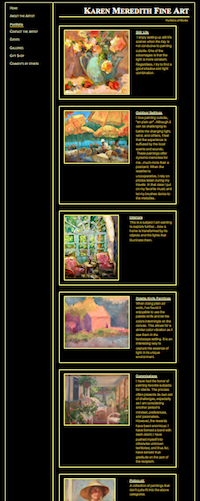
This post is intended to get you thinking. It’s just a brainstorm of ideas to start the process. I’m not saying that the ideas are brilliant or anything that’s for you.
All I’m saying is . . . think about it.
By Example
Karen Meredith, whose question spurred this series, agreed to let me use her site as an example.
As you can somewhat see in the image on the right, Karen has her paintings broken down into fairly standard and accepted categories: Still Life, Outdoor Settings, and Interiors. Then there are Palette Knife Paintings, Commissions and Potpourri (paintings that don’t fit neatly into any of the other categories).
There’s nothing wrong with this, although I would argue that the last three categories could be squeezed into the other three and be eliminated.
Think Themes
But . . . what if we looked for other themes?
Under the heading Outdoor Settings, Karen has landscapes, houses, umbrellas, boats, gardens, fences and more. There are a number of possible themes.
Houses. No, not just houses . . . “Quaint Cottages” or “Storybook Cottages.”
Gardens. No, that’s not terribly exciting. How about “Garden Entries” or “Garden Arches” or “Entering the Garden”?
In the Still Life category, we find fruits, flowers, and figurines. Hey! “Fruits, Flowers, and Figurines” could be a more interesting name. But it’s still broad.
When I squint my eyes on the page, the palettes emerge and I find myself wanting to see all of the paintings together that have blue backgrounds and pink-to-red flowers.
Then the yellow sunflowers and lemons strike me. Everyone knows that van Gogh’s Sunflowers set an auction record of $39.7 million back in 1987 (adjusted to $74.5 million in today’s market), but not everyone can own van Gogh’s version. How about your own version of sunflowers?
“Sunflowers” should be a theme. Not just because of the van Gogh story, but because they continue to be popular.
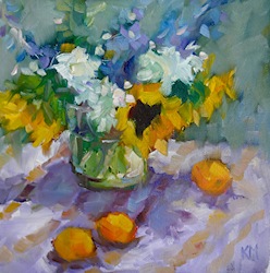
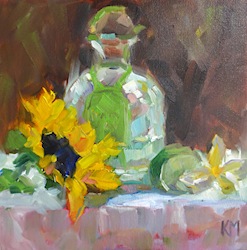
It would be nice to highlight the energy of Karen’s sunflowers in a headline. “Animated Sunflowers” or “Energetic Sunflowers”?? Not quite there, but it’s a start. Here are just three of them. What do you think would be a good headline for this grouping?
 |
 |
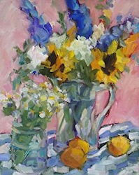 |
| All works ©Karen Meredith. Left to right: Still Life en Plein Air, Tequila Sunrise, Flowers with Apricots. Always consider how they are shown together. The order here isn’t accidental. |
||
This whole sunflower trajectory started with yellow. Color itself could be a theme for any artist, regardless of media or style.
You could have pages, as I’ve seen, for Warm, Cool, and Neutral Palettes or a single color that you favor – like Yves Klein’s blue.
I could go on and on with Karen’s site because there is a lot of variety. I think she was right in feeling the need to tighten up what she shows people.
Remember that your goal with showing your art is never to show everything you have. It’s always to Wow people – IMPACT.
One last thing. Karen has a lot of works on her portfolio pages that are Sold. While I understand that it’s nice to show that you are making sales, it’s confusing for viewers and potential gallerists. I would move Sold works to their own category. This will cut down on a lot of the visual clutter.
4 Steps to Your Remix
- Remove all Sold work or put it its own category.
- Sit with what remains for awhile. And I mean a long while. You can do this in a physical space or by moving your digital images around. I used to do this with 35mm slides and a light tray, but you can do it in an electronic document or app. Just make sure you can move the images to where you want them to be.You want to immerse yourself in your art. Be quiet. Look. Really look. Listen.The work will speak if you give it the opportunity. Ideas will emerge.
- Challenge yourself by putting two works together that you never would have imagine being together. What other pieces can you bring in to make sense of these two works? To create a cohesive narrative about them?
- Have fun with it! Be as creative with your installations (real or virtual) as you are with your art. As I said previously, you’re creating a composition made up of individual works of art rather than your chosen medium.
Does this give you any ideas?
Does it make you think that some of the programs we use to show our art online are limiting? Or perhaps it’s the online space in general that’s so limiting.
The post Remix Images of Your Art for a Fresh Look appeared first on Art Biz Success.
]]>