Your website is the 1 piece of virtual real estate that you have 100% control over. You select what people see and define how they will navigate the experience. Are you ready for them?
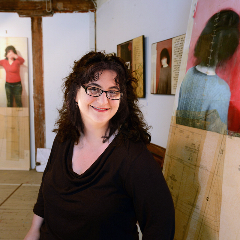
This is a focused conversation with Jessica Burko about artist websites.
The post Presenting yourself professionally on your artist website with Jessica Burko (174) appeared first on Art Biz Success.
]]>


The post Presenting yourself professionally on your artist website with Jessica Burko (174) appeared first on Art Biz Success.
]]>Museums have permanent collections that they own, but they don't keep the work in one place. They present fresh viewpoints, mixing up the pieces to give new perspectives. They also approach curating as an additive process. You start with the best and add only what will strengthen the curatorial thesis.
A museum would never try to cram as much as possible into one show.
The post Curating the Art on Your Artist Website appeared first on Art Biz Success.
]]>And I’m not talking about exhibitions here. I’m talking about how you’re showing the work on your website.
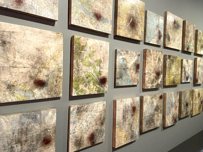
Think Like a Museum Curator
In a separate post I discussed the value of curating your art and approaching it as an additive rather than subtractive process.
I wrote:
The first step in curating your art is to start with a piece or two that best represent what you’re trying to communicate. After you’ve done this, you can build your exhibition or Web page around that piece.
If you find you have too many in the end, you can start subtracting.
That’s how I hope you view your website. Start with the strongest work and add only additional work when it makes the collection stronger. If you’re honest with yourself, you know that some of the work won’t stand up.
The Magic Number of Pieces to Show
The question that prompted this article was from a reader who wondered whether or not there is a sweet spot for the amount of inventory visible to viewers, collectors, gallerists and curators. There is no such sweet spot that would satisfy all of these groups of people, but I’ll take a stab at an answer.
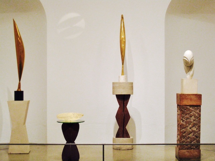
I have found that 12-15 images per website page is a good number, but impact trumps any formula.
Impact, above all else, is what you’re after. If you want people to say “WOW!” consider the following.
- What are you trying to communicate?
- What number, what piece, what grouping best communicates your idea?
- Why should you include that work? Why is it important? What does it contribute to the works you’ve already selected?
- What should you leave out? What has already sold? What doesn’t belong? What should you rethink/rework?
And … You can’t make an impact online with tiny images. Thumbnails should take up most of the width of a visible page. In I’d Rather Be in the Studio, I suggest thumbnails no smaller than 150 pixels wide, but 200-250 would be even better. In other words, thumbnails that are as big as possible.
After you have lived with the work for awhile, you might feel the need to mix things up. Again, we can go back to how curators work in museums.
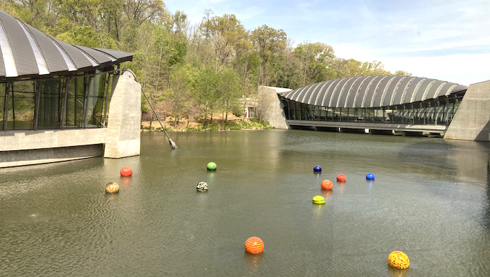
Dale Chihuly’s floating glass orbs, Niijima Floats at Crystal Bridges Museum of American Art.
Mix It Up
Museums have permanent collections that they own. The works are always in their possession, whether they’re on the wall or in storage. If the art stayed in the same place all of the time, the museum risks its role as a dynamic force in the interpretation of culture.
Museums must frequently present art in new contexts. Times change, new curators with their own viewpoints come on staff, and additional objects are added to the collections.
Fresh installations of the art stave off visitor boredom. People look at the work differently and are less likely to dismiss the art with the statement “I’ve already seen that.”
Museums do this through exhibitions. You can do the same in a brick-and-mortar space, or do it through virtual exhibitions on your website, in your newsletter, in carefully crafted blog posts, in album groupings on Facebook, or on Pinterest boards.
The bottom line is that I encourage you to approach the curatorial process like you’re making a piece of art because you are. You are creating a composition from separate parts that might have different meaning when discovered in new combinations.
Want more examples for remixing your work? Read this post.
This post was first published on August 21, 2013 and has been updated with original comments intact.
The post Curating the Art on Your Artist Website appeared first on Art Biz Success.
]]>The post Remix Images of Your Art for a Fresh Look appeared first on Art Biz Success.
]]>Today I want to give you some ideas to help freshen up your art – not just for others, but for you. You will learn things about your art when you challenge yourself to look at it in new ways.
Because we’re meeting in a virtual space, we’ll look at how this might be done on a website, but everything I share here could be applied to a live venue.
This post is intended to get you thinking. It’s just a brainstorm of ideas to start the process. I’m not saying that the ideas are brilliant or anything that’s for you.
All I’m saying is . . . think about it.
By Example
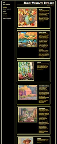
Karen Meredith, whose question spurred this series, agreed to let me use her site as an example.
As you can somewhat see in the image on the right, Karen has her paintings broken down into fairly standard and accepted categories: Still Life, Outdoor Settings, and Interiors. Then there are Palette Knife Paintings, Commissions and Potpourri (paintings that don’t fit neatly into any of the other categories).
There’s nothing wrong with this, although I would argue that the last three categories could be squeezed into the other three and be eliminated.
Think Themes
But . . . what if we looked for other themes?
Under the heading Outdoor Settings, Karen has landscapes, houses, umbrellas, boats, gardens, fences and more. There are a number of possible themes.
Houses. No, not just houses . . . “Quaint Cottages” or “Storybook Cottages.”
Gardens. No, that’s not terribly exciting. How about “Garden Entries” or “Garden Arches” or “Entering the Garden”?
In the Still Life category, we find fruits, flowers, and figurines. Hey! “Fruits, Flowers, and Figurines” could be a more interesting name. But it’s still broad.
When I squint my eyes on the page, the palettes emerge and I find myself wanting to see all of the paintings together that have blue backgrounds and pink-to-red flowers.
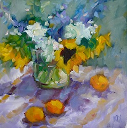
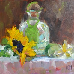
Then the yellow sunflowers and lemons strike me. Everyone knows that van Gogh’s Sunflowers set an auction record of $39.7 million back in 1987 (adjusted to $74.5 million in today’s market), but not everyone can own van Gogh’s version. How about your own version of sunflowers?
“Sunflowers” should be a theme. Not just because of the van Gogh story, but because they continue to be popular.
It would be nice to highlight the energy of Karen’s sunflowers in a headline. “Animated Sunflowers” or “Energetic Sunflowers”?? Not quite there, but it’s a start. Here are just three of them. What do you think would be a good headline for this grouping?
 |
 |
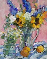 |
| All works ©Karen Meredith. Left to right: Still Life en Plein Air, Tequila Sunrise, Flowers with Apricots. Always consider how they are shown together. The order here isn’t accidental. |
||
This whole sunflower trajectory started with yellow. Color itself could be a theme for any artist, regardless of media or style.
You could have pages, as I’ve seen, for Warm, Cool, and Neutral Palettes or a single color that you favor – like Yves Klein’s blue.
I could go on and on with Karen’s site because there is a lot of variety. I think she was right in feeling the need to tighten up what she shows people.
Remember that your goal with showing your art is never to show everything you have. It’s always to Wow people – IMPACT.
One last thing. Karen has a lot of works on her portfolio pages that are Sold. While I understand that it’s nice to show that you are making sales, it’s confusing for viewers and potential gallerists. I would move Sold works to their own category. This will cut down on a lot of the visual clutter.
4 Steps to Your Remix
- Remove all Sold work or put it its own category.
- Sit with what remains for awhile. And I mean a long while. You can do this in a physical space or by moving your digital images around. I used to do this with 35mm slides and a light tray, but you can do it in an electronic document or app. Just make sure you can move the images to where you want them to be.You want to immerse yourself in your art. Be quiet. Look. Really look. Listen.The work will speak if you give it the opportunity. Ideas will emerge.
- Challenge yourself by putting two works together that you never would have imagine being together. What other pieces can you bring in to make sense of these two works? To create a cohesive narrative about them?
- Have fun with it! Be as creative with your installations (real or virtual) as you are with your art. As I said previously, you’re creating a composition made up of individual works of art rather than your chosen medium.
Does this give you any ideas?
Does it make you think that some of the programs we use to show our art online are limiting? Or perhaps it’s the online space in general that’s so limiting.
The post Remix Images of Your Art for a Fresh Look appeared first on Art Biz Success.
]]>The post Should Your Older Art Be Put Out to Pasture? appeared first on Art Biz Success.
]]>I’m not talking about the horses running the Triple Crown races this year.
I’m talking about your art.

Keep Older Art Images Out of . . .
- Portfolio presentations – in general. Galleries and patrons commissioning work probably want to see recent work only, but a museum curator would want to see your life’s work. ALWAYS keep out any work (old or new) that isn’t up to par or that looks like it is a student piece.
- Exhibit proposals. If you want to show your newest work, keep the old stuff out of sight. See below for retrospectives.
- Juried show entries. Most juried shows state the time frame in which the art should have been produced. Newer art is favored here.
Where You Can Show Older Art
- In the archived work on your website. As I explain in I’d Rather Be in the Studio your newest work should be front and center. Older work can be archived in deeper (not main) links.Do not call work “Older” on your website! Use the term “archived” or use dates to categorize. Like it or not, “older” doesn’t incite enthusiasm.
- Retrospective exhibitions. Retrospectives are my favorite exhibitions because an artist’s entire oeuvre can be studied at once. Why not have your own retrospective? Or dare you have a show of only older work?
- In blog posts. Don’t hesitate to feature older work in blog posts in order to tell stories and compare to newer work.
- On your Facebook Timeline. Use older work to beef up your business page Timeline and provide a virtual retrospective.
I think I’ve just hit the basics here. What else might be in question?
The post Should Your Older Art Be Put Out to Pasture? appeared first on Art Biz Success.
]]>The post Use Tables to Line Up Your Résumé appeared first on Art Biz Success.
]]>Difficulty lining up the dates in the left and content on the right.
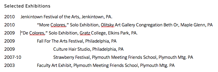
If you’re using Microsoft Word to create your résumé and are finding your columns out of line, I suggest using the Tables feature.
Unfortunately, it rarely works out to “convert” your existing text to a table. Instead, it’s better to start a table from scratch.
1. Create a table by going to Table/Insert Table. Select the number of rows and columns you need. Opt for more rows because it’s easier to delete rows than add them. And you should just need 2 columns.
Word will create a column where you can copy and paste your existing data. It will look kind of like this by default.
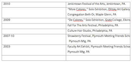
2. To tweak your table, put your cursor over the line in the center of the table and drag left. That will get your columns where you want them. You can also tweak your row height by putting your cursor on a row line and dragging it up or down. But you still have those darned borders, which you don’t want to show up on a resume.
To get rid of these, highlight your table and go to Table/Table Properties.
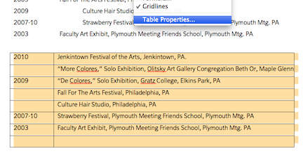
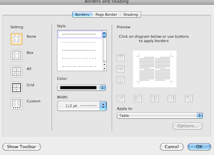
The screen will open to the default Borders page. Just select None and then OK and your borders will disappear. Note: The borders look gray on your screen, but that’s just so you can see the boundaries. They will be invisible when printed or saved as a PDF file.
Voila! Beautifully lined-up columns.
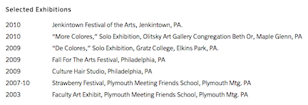
Thanks to Dora Ficher for the use of her résumé.
The post Use Tables to Line Up Your Résumé appeared first on Art Biz Success.
]]>The post Manage Your Artist Portfolio in WordPress appeared first on Art Biz Success.
]]>Artists and others can use the WordPress blogging platform as a content management system (CMS) for their online presence.
You can manage your portfolio, update your CV, and post upcoming shows and exhibitions by using WordPress PAGES. Imagine being able to update your website anytime, anywhere and without having to ask, wait or pay someone to do it for you! And best of all WordPress is open source meaning it’s free.
Here are the 5 steps you will need to take in order to use WordPress as a CMS–provided you already have WordPress installed with a suitable hosting company.
1. Change the “Reading” settings to a static page. What this does is remove the blog posts from being your home page and uses a standard (static) page of your choice instead.

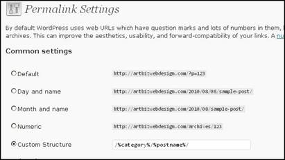
2. Change the “Permalinks” to Custom Structure. This will display your page URL’s in the browsers address bar like a typical website. So rather than have your portfolio appear as www.yoursitename.com/?p=123 it will look like www.yoursitename.com/portfolio/
3. Uncheck the top 3 boxes under the Discussion Settings to close the comments and remove the links to and from other blogs.

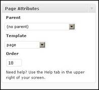
4. While this will remove the comments box from the site it will by default cause a “Comments are Closed” to appear. To prevent this from happening you need a page template with the comment loop removed to be part of your theme. When creating a new page ensure you select the “page” template from the Page Attributes menu.
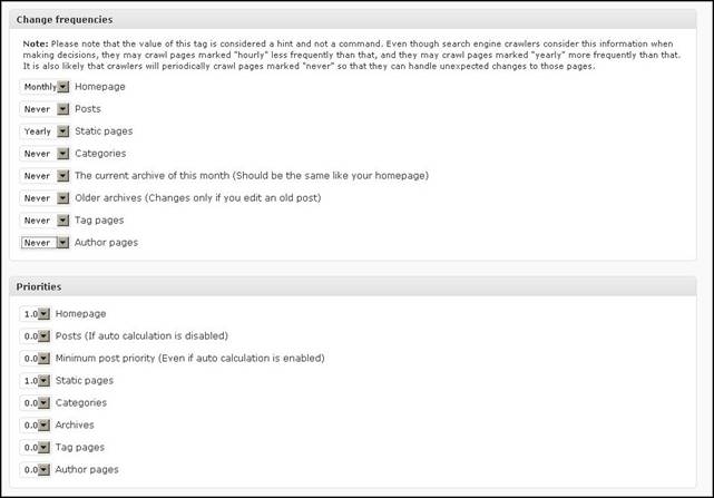
5. Get the Google XML Sitemap plugin and configure it so that the Priorities are set high for Static Pages and low for Posts. Also set the Change Frequencies for Posts to Never and–if you are updating your static pages, adding new work to your site on a regular basis–set the Change Frequencies to daily, weekly, monthly or what ever suits.
This tells the search engine crawlers when they should look for new content. Google XML Sitemaps adds a sitemap to your site which is used by the crawlers to find and index your content on the major search engines. It also notifies Google, Bing, Ask and Yahoo about updates to your site.
Once the 5 steps are complete you will have WordPress configured to use as a content management system without the blog component. All you have to do from here is add your content.
WordPress is user friendly and easy to use. When asked how easy I usually say if you can attach an image to an email and type in text editor like Word then you can use WordPress.
I would love to help you with your WordPress site. Just visit artbiz.ca to review all the services I offer. Be sure to take advantage of my “Giving Artists a Break” website by donation program for artists.
space
Kim Bruce runs Artbiz: the business of art “web design,” where she creates websites for creative types. She is an artist herself and uses WordPress as both a CMS and a blog. Kim works out of her office/studio located in the foothills of Alberta just outside of Calgary.
The post Manage Your Artist Portfolio in WordPress appeared first on Art Biz Success.
]]>The post Tweak Your About Page appeared first on Art Biz Success.
]]>The post Tweak Your About Page appeared first on Art Biz Success.
]]>The post Art Marketing Action: Work On Your Biography appeared first on Art Biz Success.
]]>The formal bio is you at your most professional. It’s straight-laced–some might even say “stiff.” It’s what you hand in with your job, grant, or gallery application. The formal bio is what you learn to write in your last semester of art school.

In short, your formal bio is your résumé in paragraph form. Take the highlights from the dates and bullet points on your résumé and make a story out of them. Here’s an example of an easy 3-part artist’s bio that I like to use with clients.
1. Opening Paragraph
I like to start a bio with a one- or two-sentence summary of the artist statement. This lets the reader knows immediately about your current work and gives context to what comes after it.
2. Middle Paragraph(s)
This is where you list your accomplishments. They could be–like your résumé–in reverse chronological order or according to importance. Don’t highlight something you did thirty years ago and leave it at that. You want to sound vibrant and relevant today. Aim for a paragraph or two in this section.
3. Closing Paragraph
Mention your education, where you’ve lived, where you reside, your birth location and—if desired–your year of birth.
PODCAST
The podcast is an audio version of this content.
[powerpress url=”http://artbizsuccess.com/audio/workonbio.mp3″]
The post Art Marketing Action: Work On Your Biography appeared first on Art Biz Success.
]]>